The Problem
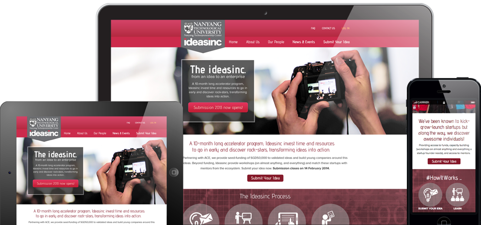
The old Ideasinc website does not have an established branding. The colour scheme is inconsistent, and the interface looks rather kiddish, which could be a little turn-off for serious investors. The user experience is also not very fluid which potentially turned some visitors away when they had difficulty locating the events sign up buttons!
E1 Solution
We designed a Parallax Scrolling website, in which most of the key information about the initiative and their signature event (#StartingUp) are neatly illustrated and organized on the front page. User experience is also seamless between various mobile screen resolutions leaving visitors with no excuse not to keep reading or sign up for the events!


